Since I spend my most of working hours on motion sensor and image data, I thought it’d be fun to dig around some other interesting areas to apply my skills. Then I thought: “Hey, there are tons of easily accessible data around stock and foreign exchange rate. Let’s see if I can make something useful out of them.”
I’ve never had any training in financial sector, other than learning how to file my taxes (but I gave up learning it after a few hours and decided to delegate that task to my accountant). So, the following is the result I’ve achieved through some trials and errors over a few weekends:

I am a firm believer in KISS (Keep it simple, stupid) principle. I’ve tried my best to keep the code short and sweet. If anything is unclear, let me know and I will try my best to explain it.
Outlines
- Obtaining Data
- Feature Exploration
- Shaping Data
- Training
- Testing
- Postmortem
Obtaining Data
The first thing I did was to obtain the Oanda. There is a Python library that encapsulates Oanda’s REST API v2 that was easy to deal with. For my model, I used historical USDCAD rates since Jan 1. 2012 (about <6 years worth) which I think, was a decent size.
Let the coding begin
First import libraries.
# In my case, I was using Keras to build the models with TensorFlow backend with GPU support
from keras.models import Sequential
from keras.layers import Dense, Dropout, Activation, Input, LSTM, Dense, merge, Flatten
from keras.models import load_modelfrom sklearn.preprocessing import MinMaxScaler
from sklearn.metrics import mean_squared_error
from sklearn.decomposition import PCA, KernelPCAimport pandas as pd
import numpy as np
import matplotlib.pyplot as plt
import seaborn as sns#Used TA-Lib for creating additional features. More on this later.
from talib.abstract import *
from talib import MA_Type
Configuration variables:
TARGET     = 'USD_CAD'
granuality = 'H1'
LOOK_BACK  = 20
SPLIT      = 0.99 # data split ration for training and testing
Below is what the data look like:
DATA.head()
Feature Exploration
Adding more features which helped improving the accuracy. Also, by adding hour, day, and week, I think it helped with mitigating a seasonality problem.
# Compute various features that were not available in the raw data
DATA['hour'] = DATA.index.hour
DATA['day']  = DATA.index.weekday
DATA['week'] = DATA.index.week
DATA['volume'] = pd.to_numeric(DATA['volume'])
DATA['close']  = pd.to_numeric(DATA['close'])
DATA['open']   = pd.to_numeric(DATA['open'])
DATA['momentum']   = DATA['volume'] * (DATA['open'] - DATA['close'])
DATA['avg_price']  = (DATA['low'] + DATA['high'])/2
DATA['range']      = DATA['high'] - DATA['low']
DATA['ohlc_price'] = (DATA['low'] + DATA['high'] + DATA['open'] + DATA['close'])/4
DATA['oc_diff']      = DATA['open'] - DATA['close']
DATA['spread_open']  = DATA['ask_open'] - DATA['bid_open']
DATA['spread_close'] = DATA['ask_close'] - DATA['bid_close']inputs = {
    'open'   : DATA['open'].values,
    'high'   : DATA['high'].values,
    'low'    : DATA['low'].values,
    'close'  : DATA['close'].values,
    'volume' : DATA['volume'].values
}
DATA['ema'] = MA(inputs, timeperiod=15, matype=MA_Type.T3)
DATA['bear_power'] = DATA['low'] - DATA['ema']
DATA['bull_power'] = DATA['high'] - DATA['ema']# Since computing EMA leave some of the rows empty, we want to remove them. (EMA is a lagging indicator)
DATA.dropna(inplace=True)# Add 1D PCA vector as a feature as well. This helped increasing the accuracy by adding more variance to the feature set
pca_input = DATA.drop('close').copy()
pca_features = pca_input.columns.tolist()
pca = PCA(n_components=1)
DATA['pca'] = pca.fit_transform(pca_input.values.astype('float32'))
Note: I’ve used TA-Lib to compute EMA then computed Bears Power, and Bulls Power as features.
What my data looked like after adding all the features:

Let’s verify that bull_power and bear_power adds some values by creating more variance in feature sets, we want to check the correlation heat map between these features:
t = DATA[['close', 'bull_power', 'bear_power']].copy()
t['pct_change'] = t['close'].pct_change()
t.dropna(inplace=True)corr =  t.corr()
mask = np.zeros_like(corr, dtype=np.bool)
mask[np.triu_indices_from(mask)] = True
f, ax = plt.subplots(figsize=(5, 5))
cmap = sns.diverging_palette(220, 10, as_cmap=True)
sns.heatmap(corr, mask=mask, cmap=cmap, ax=ax)
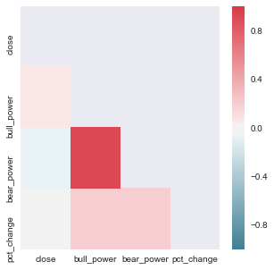
Okay, there was some degree of correlation which can be useful.
Let’s check PCA feature vector:
import matplotlib.colors as colors
import matplotlib.cm as cm
import pylabnorm = colors.Normalize(DATA['high'].values.min(), DATA['high'].values.max())
color = cm.viridis(norm(DATA['high'].values))for col in DATA.columns.tolist():
    if col != 'pca':
        plt.figure(figsize=(10,5))
        plt.scatter(DATA[col].values, DATA['pca'].values, lw=0, c=color, cmap=pylab.cm.cool, alpha=0.3, s=1)
        plt.title(col + ' vs pca')
        plt.show()
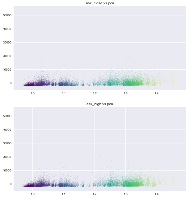

There was to be some degree of seperation in PCA plot. It wouldn’t hurt to utilize it.
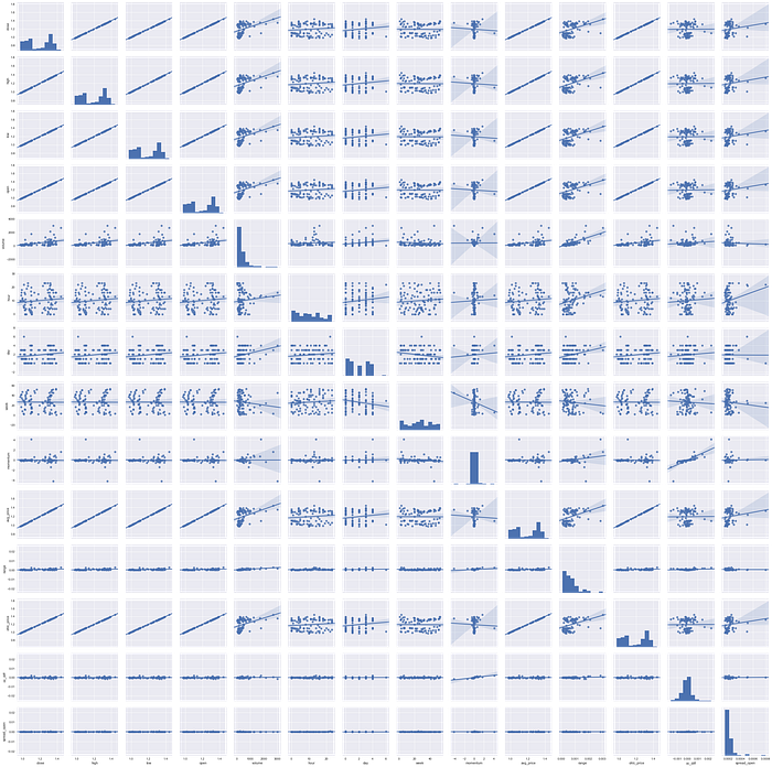
Overall correlation pair plots
(This was pretty useless and took a very long time to generate, but thought it looked cool)
Shaping Data
Note: I based the below code out from machinelearningmastery.com. Seriously good stuff there.
Function that converts Pandas DataFrame into LSTM friendly format:
def create_dataset(dataset, look_back=10):
    dataX, dataY = [], []
    for i in range(len(dataset)-look_back-1):
        a = dataset[i:(i+look_back)]
        dataX.append(a)
        dataY.append(dataset[i + look_back])
    return np.array(dataX), np.array(dataY)
Scale, reshape, and group the data into training and testing.
# Create scalers
scaler = MinMaxScaler()
scaled = pd.DataFrame(scaler.fit_transform(DATA), columns=DATA.columns)x_scaler = MinMaxScaler(feature_range=(0, 1))
x_scaler = x_scaler.fit(DATA.drop('high', axis=1).values.astype('float32'))
y_scaler = MinMaxScaler(feature_range=(0, 1))
y_scaler = y_scaler.fit(DATA['high'].values.astype('float32'))# Create dataset
target_index = scaled.columns.tolist().index('high')
dataset = scaled.values.astype('float32')X, y = create_dataset(dataset, look_back=LOOK_BACK)
y = y[:,target_index]train_size = int(len(X) * SPLIT)
trainX = X[:train_size]
trainY = y[:train_size]
testX = X[train_size:]
testY = y[train_size:]
Training
Now, let’s create a relatively small LSTM network to do our prediction.
model = Sequential()
model.add(LSTM(20, input_shape=(X.shape[1], X.shape[2]), return_sequences=True))
model.add(LSTM(20, return_sequences=True))
model.add(LSTM(10, return_sequences=True))
model.add(Dropout(0.2))
model.add(LSTM(4, return_sequences=False))
model.add(Dense(4, init='uniform', activation='relu'))
model.add(Dense(1, init='uniform', activation='relu'))
Compile the model, make sure to save the best weight found during the training process, and let the training begin!
from keras.callbacks import ModelCheckpoint
from keras.callbacks import TensorBoardmodel.compile(loss='mean_squared_error', optimizer='adam', metrics=['mae', 'mse'])filepath="weights.best.hdf5"
checkpoint = ModelCheckpoint(filepath, monitor='val_mean_squared_error', verbose=1, save_best_only=True, mode='min')
# Enable this line if you want to monitor the trianing progress via TensorBoard
# tensorboard = TensorBoard(log_dir="logs/{}".format(time()))
callbacks_list = [checkpoint]
history = model.fit(trainX, trainY, epochs=100, batch_size=500, callbacks=callbacks_list, validation_split=0.1)
Once the initial training is done, you end up with a fairly sub-optimal weights. In my case, the validation mean squared error was around 0.49. Not very ideal but it did get our weights closer to the optimal weights.
To improve the weights towards the global optimal, I retrained the model with LearningRateScheduler added. By taking a smaller learning rate at every 10 epoch, the validation mean squared error went from 0.49 to 0.000000203.
from keras.callbacks import LearningRateScheduler
import keras.backend as K
def scheduler(epoch):
    if epoch%10==0 and epoch!=0:
        lr = K.get_value(model.optimizer.lr)
        K.set_value(model.optimizer.lr, lr*.9)
        print("lr changed to {}".format(lr*.9))
    return K.get_value(model.optimizer.lr)lr_decay = LearningRateScheduler(scheduler)
callbacks_list = [checkpoint, tensorboard, lr_decay]
history = model.fit(trainX, trainY, epochs=100, batch_size=500, callbacks=callbacks_list, validation_split=0.1)
Testing
Once the training was complete, I’ve loaded the best weights discovered to my model and checked if the prediction worked as intended.
predictions = pd.DataFrame()
predictions['predicted'] = pd.Series(np.reshape(unscaled_pred, (unscaled_pred.shape[0])))
predictions['actual'] = testY[-pred_count:]
predictions['actual'] = predictions['actual'].shift(2)
predictions['actual_pure'] = DATA[label].values[-pred_count:]
predictions['low'] = DATA['low'].values[-pred_count:]
predictions['high'] = DATA['high'].values[-pred_count:]
predictions['timestamp'] = DATA.index[-pred_count:]
predictions['actual_pure'] = predictions['actual_pure'].shift(2)
predictions['low'] = predictions['low'].shift(2)
predictions['high'] = predictions['high'].shift(2)
predictions.dropna(inplace=True)
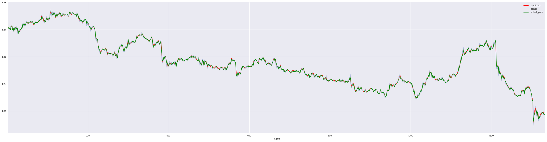
p = predictions.reset_index().copy()ax = p.plot(x='index', y='predicted', c='red', figsize=(40,10))
ax = p.plot(x='index', y='actual', c='white', figsize=(40,10), ax=ax)
ax = p.plot(x='index', y='actual_pure', c='green', figsize=(40,10), ax=ax)
plt.fill_between(x='index', y1='low',y2='high', data=p, alpha=0.4)
# Zoom into the first 200 of test set
p = predictions[:200].reset_index().copy()
ax = p.plot(x='index', y='predicted', c='red', figsize=(40,10))
ax = p.plot(x='index', y='actual', c='white', figsize=(40,10), ax=ax)
ax = p.plot(x='index', y='actual_pure', c='green', figsize=(40,10), ax=ax)
plt.fill_between(x='index', y1='low', y2='high', data=p, alpha=0.4)
plt.title('zoomed, first 200')
plt.show()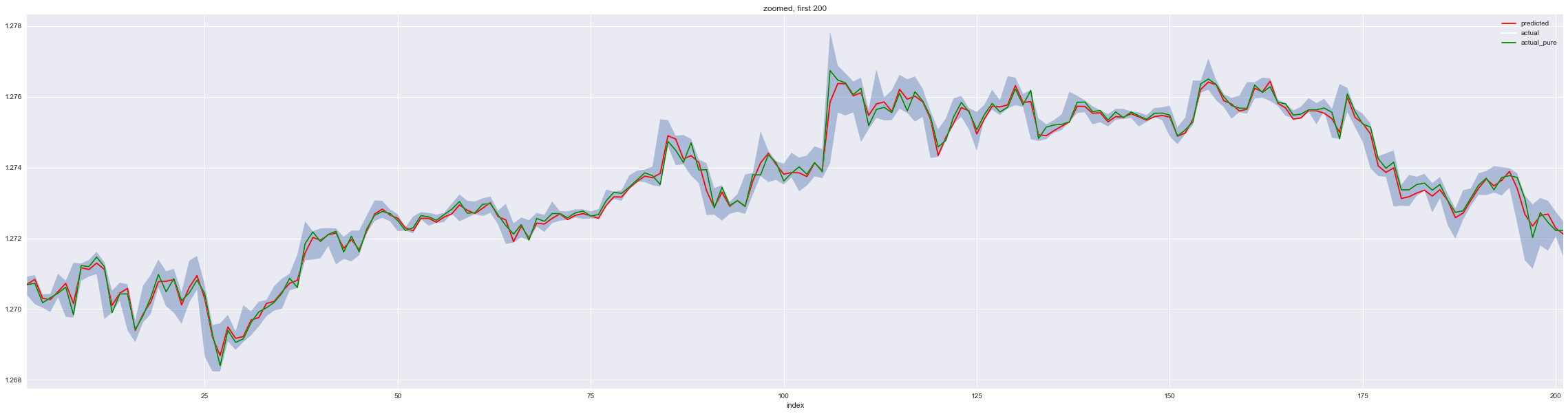
# Zoom to the last 200 of test set
p = predictions[-200:].reset_index().copy()
ax = p.plot(x='index', y='predicted', c='red', figsize=(40,10))
ax = p.plot(x='index', y='actual', c='white', figsize=(40,10), ax=ax)
ax = p.plot(x='index', y='actual_pure', c='green', figsize=(40,10), ax=ax)
plt.fill_between(x='index', y1='low',y2='high', data=p, alpha=0.4)
plt.title('zoomed, last 200')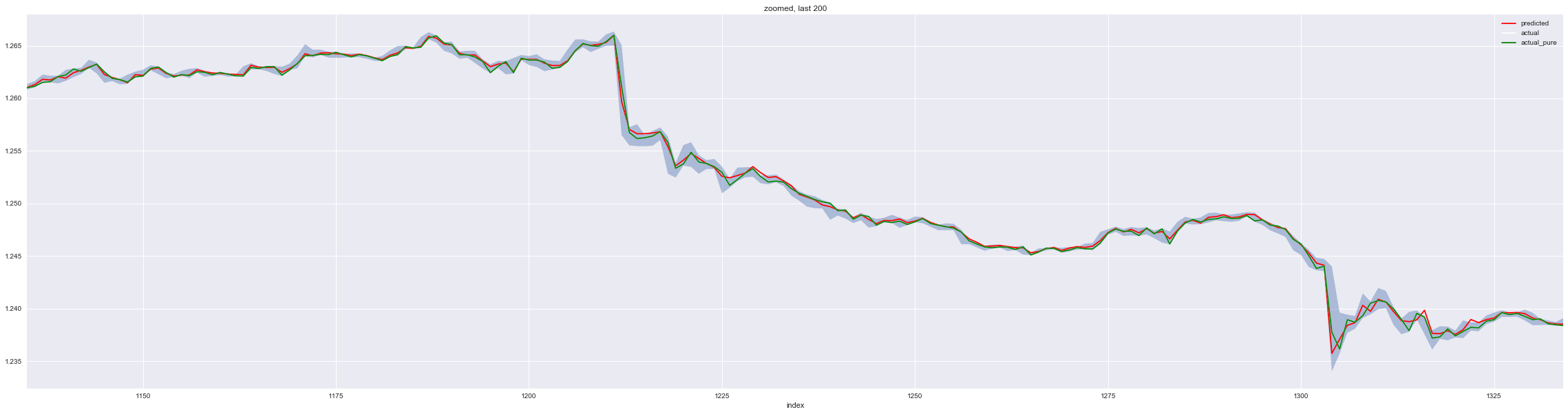
#Distribution of difference between actual and prediction
predictions['diff'] = predictions['predicted'] - predictions['actual']
sns.distplot(predictions['diff']);
plt.title(TARGET + ' Distribution of difference between actual and prediction')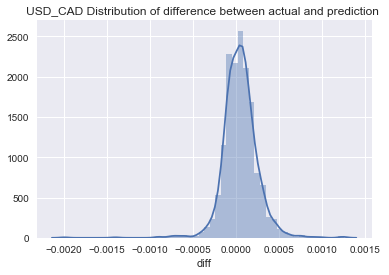
g = sns.jointplot("diff", "predicted", data=predictions, kind="kde", space=0)
plt.title(TARGET + ' Distributtion of error and price')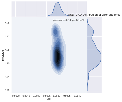
# Correctly predicted prices
predictions['correct'] = (predictions['predicted'] <= predictions['high']) & (predictions['predicted'] >= predictions['low'])
sns.factorplot(data=predictions, x='correct', kind='count')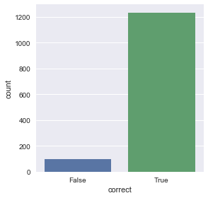
predictions['diff'].describe()
# Output
count    1333.000000
mean        0.000048
std         0.000205
min        -0.001998
25%        -0.000064
50%         0.000046
75%         0.000154
max         0.001255
Name: diff, dtype: float64print("MSE : ", mean_squared_error(predictions['predicted'].values, predictions['actual'].values))
# Output: MSE :  4.41091e-08
Not bad. Out from 1333 tests using the most recent data, most of the predictions were well within the price range. Meaning that at some point in the next 15 minute, the price will intersect with the predicted price. However, note thatt he prediction was off by $0.001255 at max, which could be pretty big, it would be dangerous if it happens often.
Postmortem
I’ve tried running the above model against the actual market for a few weeks. It performed well for a few days but three things were observed that made the system not very useful.
- It was not capable of reacting to sudden news nor any political movements. In which cases, those unpredictable events ultimately wiped out the entire profit. One random tweet can ruin the whole thing.
- Each prediction was rather conservative and therefore profit gained from a trade was low.
- Cost(spread) eats up everything.
The combination of the three problems have led me to come up with a new method. I will write about it in the next post.
Update: I was asked to publish the notebook but I have been very busy to clean up the notebook and release. For those who are interested in trying this out, I had a similar one written at Kaggle that you can fork.
This post references an opinion and is for information purposes only. It is not intended to be investment advice. Seek a duly licensed professional for investment advice.